Designers favorite option which did not get chosen.
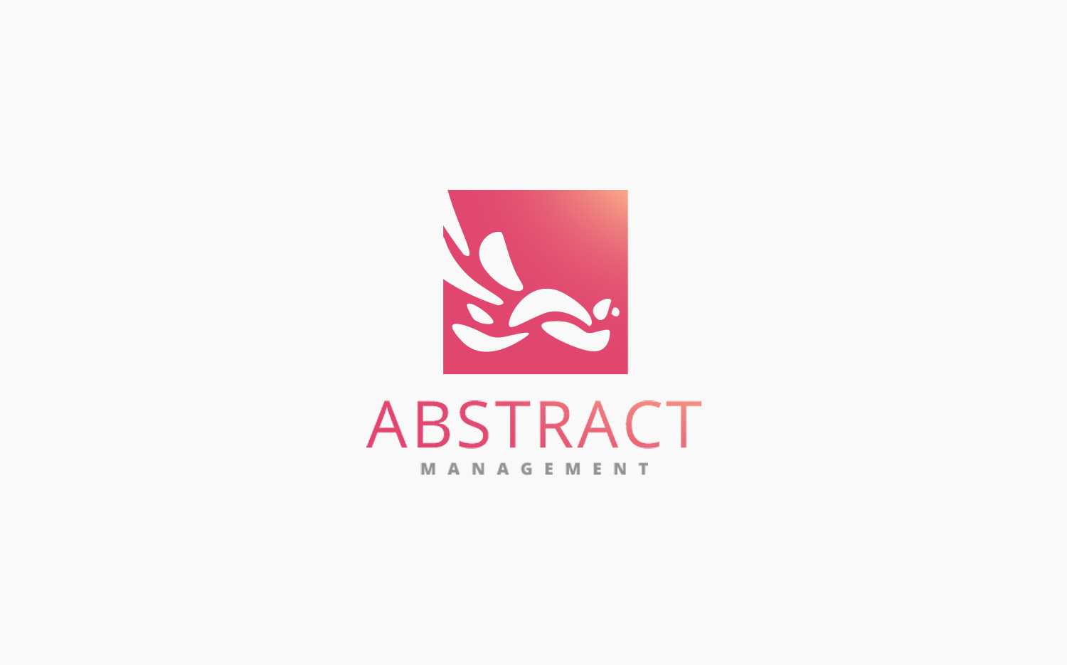
”As the business is called "Abstract", this logo could go many ways. After a couple of sketches I chose to go with a solid square filled with abstract shapes and a clean sans-serif font. This logo is one of my personal favorites for both its simplicity and playful arrangement.
Thomas DielenCEO Coreseven
The assignment
The client asked me to redesign a logo she had made by another designer. The task was clear from the get-go, as the logo she sent was way too complex to be used properly on various mediums. After sending through three proposals, the client was on board with two versions.
One version was true to the original logo, but simplified and much more suitable for both digital and print purposes. However, the other option was my personal favorite and didn’t get the pick in the end.
“I love love love the first one and the third one... But if I had to choose one i'd go with the first one, its my absolute favorite.”
Kayla JamesAbstract Management
Clients choice