The new logo design
”"The identity updates Slack’s familiar hashtag logo to work consistently in different scales and contexts."
PentagramMichael Bierut and team
“It uses a simpler color palette and, we believe, is more refined, but still contains the spirit of the original. It’s an evolution, and one that can scale easily, and work better, in many more places.”
Slackfrom their post about the design change
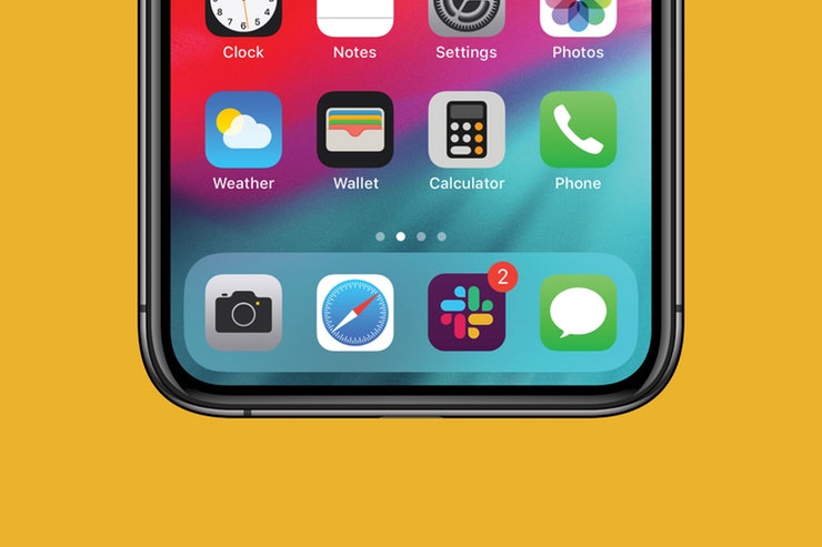
“We’ll not bore you with the design thinking and the meaning of every angle and curve of the new logo—you’re busy people, and our main intention for this post was to let you know about the change, so you won’t be too surprised when the icons on your phone/laptop/tablet look a little different. They’ll look, in fact, reassuringly similar.”
Slackfrom their post about the design change
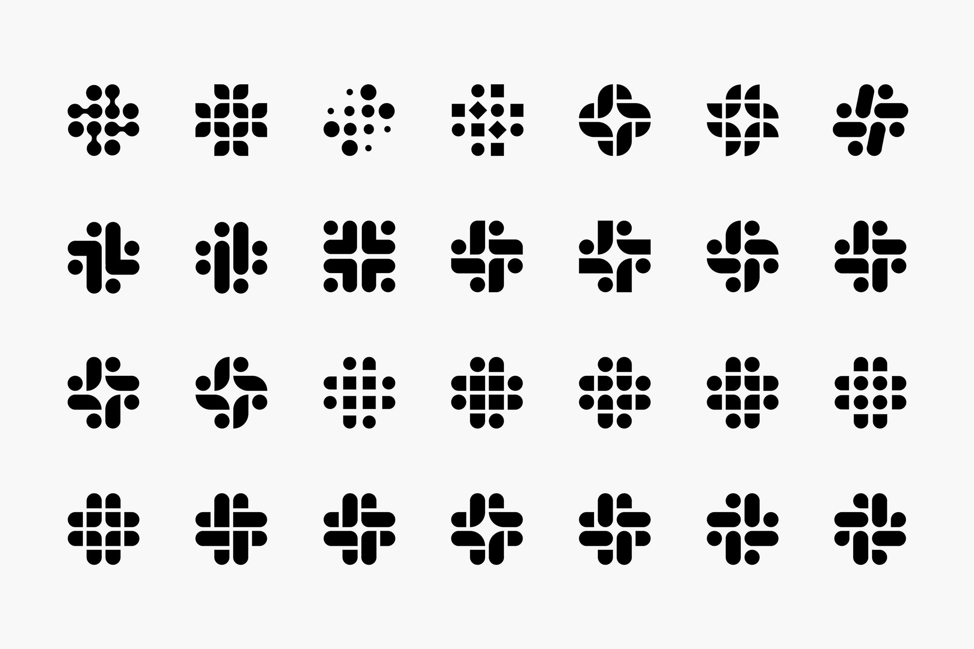
Range of possibilities
These are the explorations the design team considered. The octothorpe was one thing they were clear on keeping.
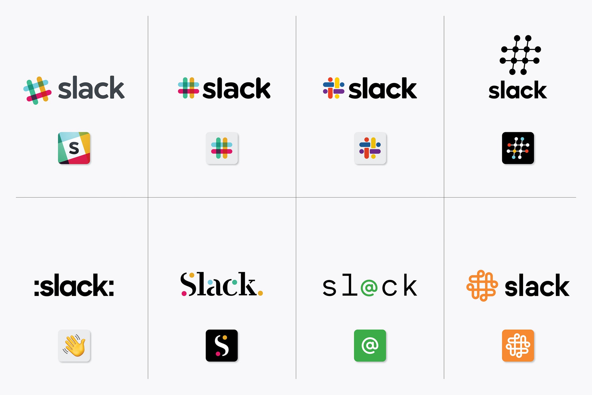
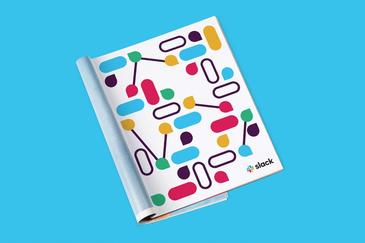
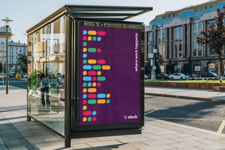
Examples of branding
Over the coming months, the new direction will roll out across Slack and its brand expressions, including the website, in advertising and in some places in the software itself.